Pie charts are a popular way to visually represent data in a circular format. They are easy to create, easy to read, and can provide valuable insights into a dataset.
In this article, we will cover everything you need to know about pie charts, including what they are, why they are useful, what to include in a pie chart, how to create one, and some tips for effectively using pie charts.
What is a Pie Chart?
A pie chart is a type of graph that displays data in a circular format. The circle is divided into slices, or wedges, that represent the proportion of each category in the dataset. The size of each slice is proportional to the value it represents, making it easy to see which categories are larger or smaller in relation to each other.
Why Use Pie Charts?
Pie charts are useful for visualizing data that is divided into categories or segments. They are particularly effective for showing relative proportions or percentages within a dataset. Pie charts are easy to understand at a glance, making them a popular choice for presentations, reports, and other forms of data visualization.
What to Include in a Pie Chart
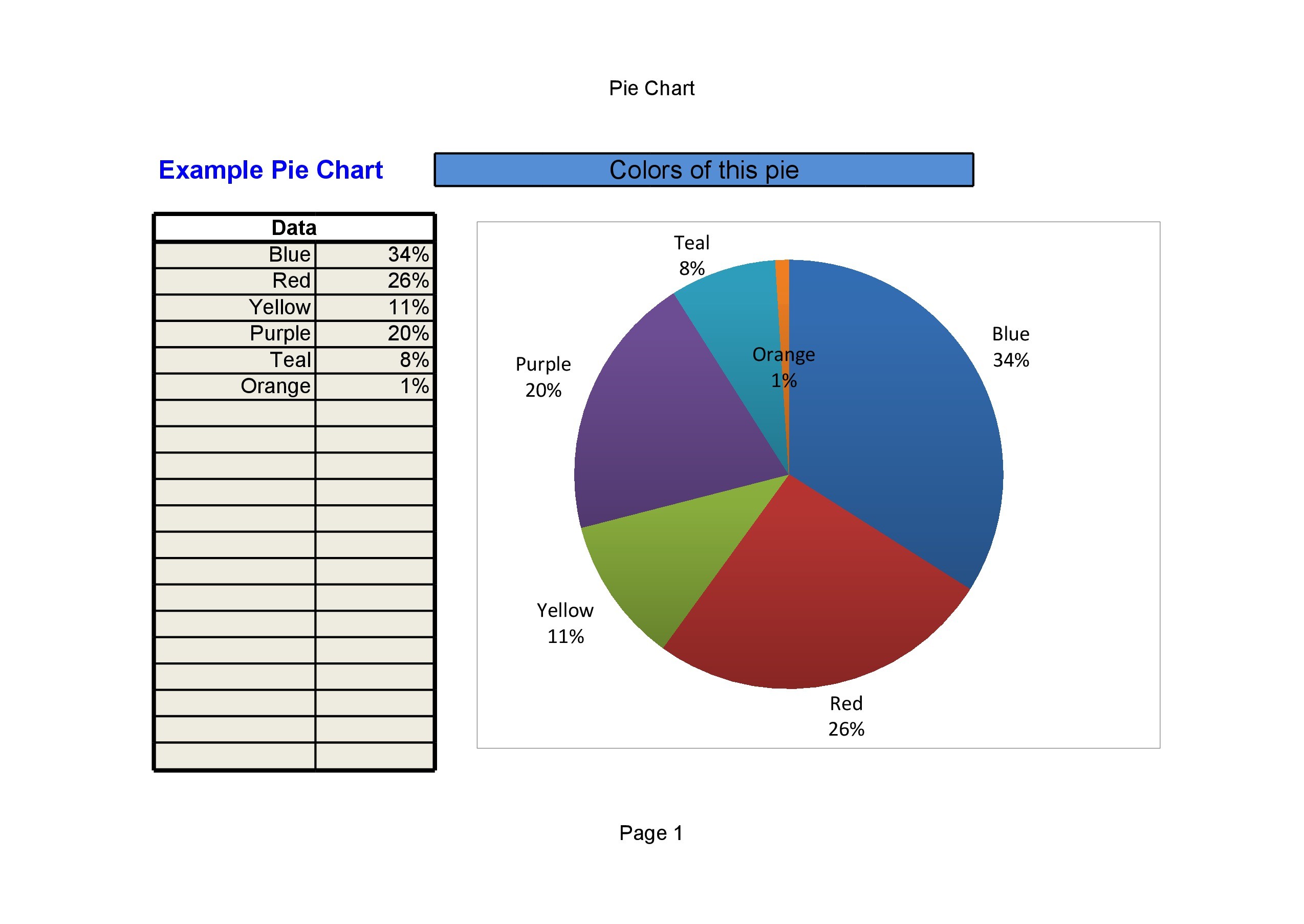
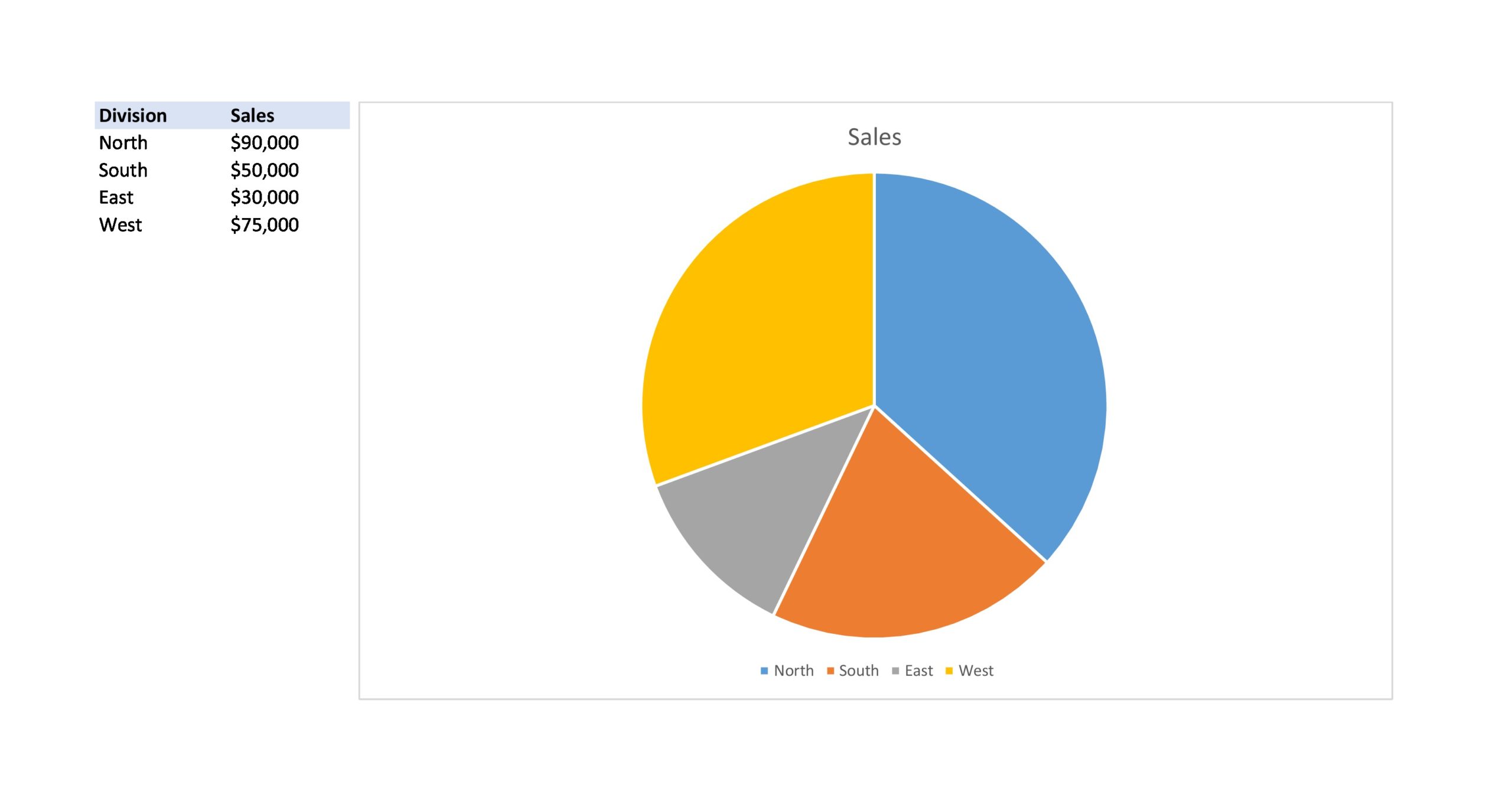
When creating a pie chart, it is important to include all the categories or segments of the dataset. Each slice of the pie should represent a different category, and the size of each slice should accurately reflect the proportion of that category within the dataset. Labels should be used to identify each category, and a legend or key may be included to provide additional information.
Examples
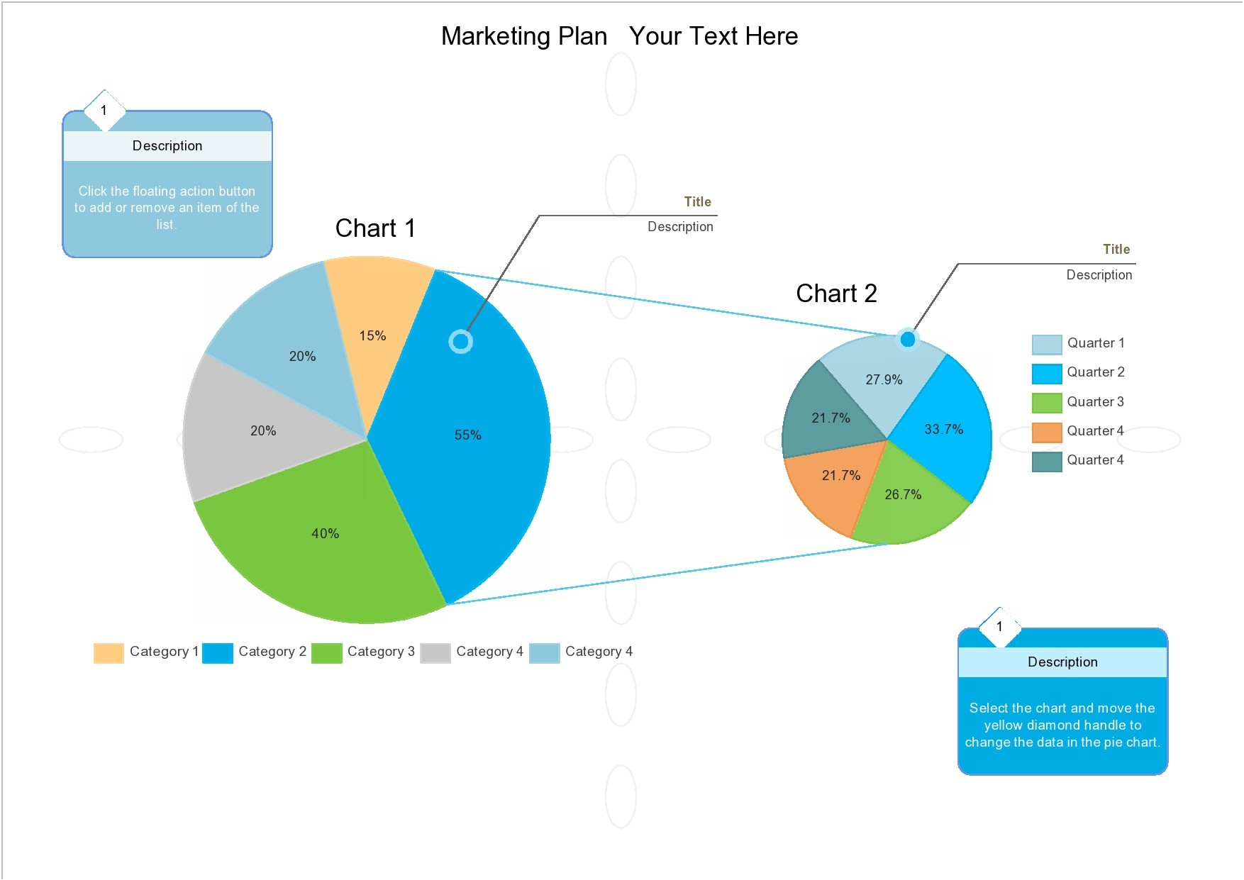
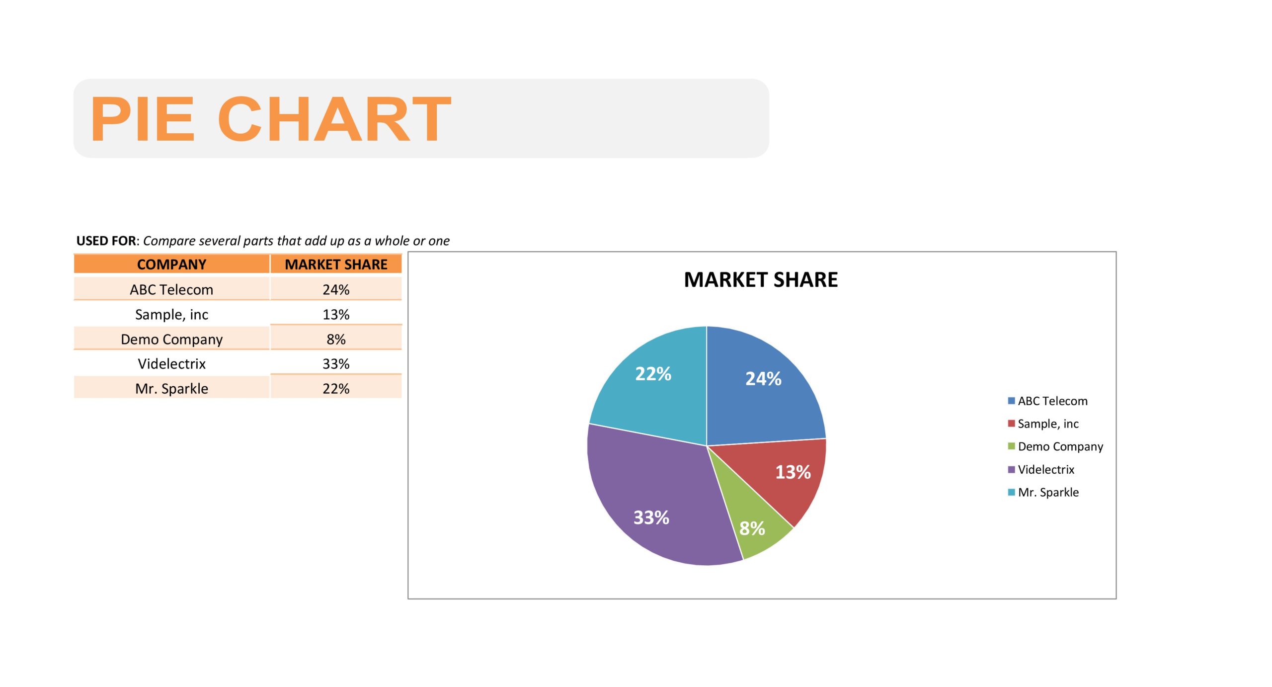
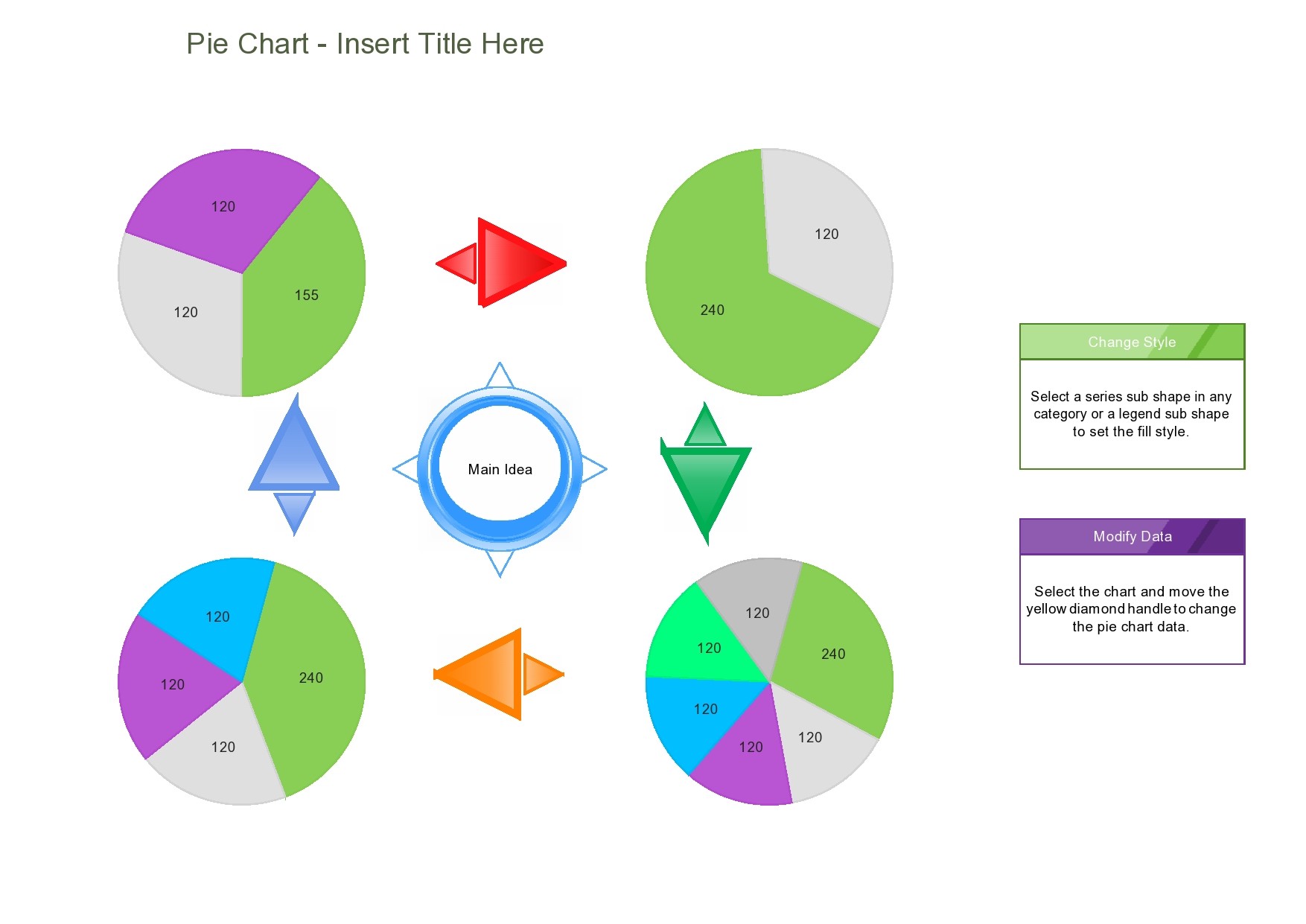
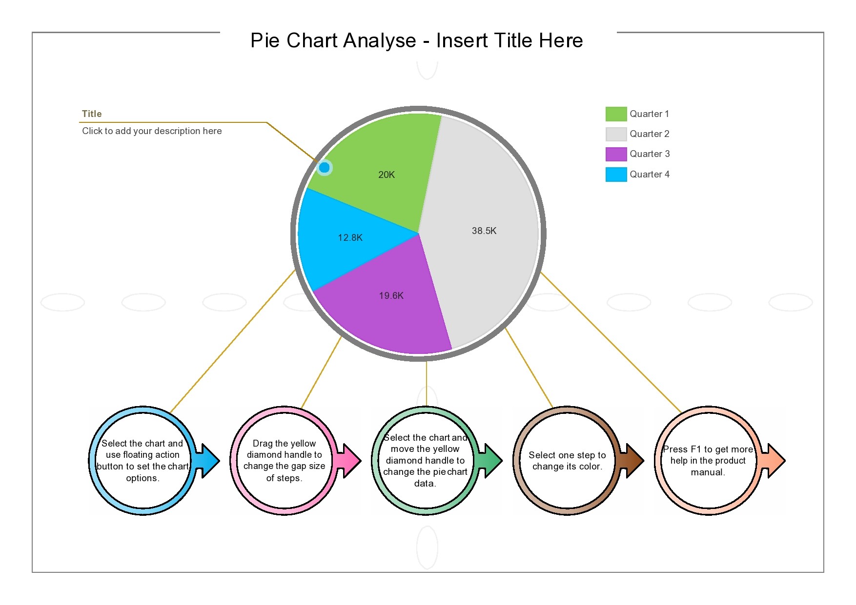
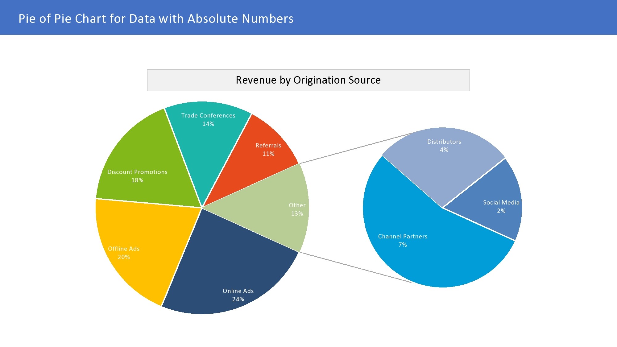
How to Create a Pie Chart
Creating a pie chart is relatively simple, especially with the help of spreadsheet software or data visualization tools. Here are the basic steps to create a pie chart:
- Step 1. Enter your data into a spreadsheet or data visualization tool.
- Step 2. Select the data you want to include in the pie chart.
- Step 3. Choose the pie chart option from the chart menu.
- Step 4. Customize the colors, labels, and other elements of the chart as needed.
- Step 5. Insert the chart into your presentation, report, or document.
Tips for Using Pie Charts
While pie charts can be a powerful tool for visualizing data, there are some best practices to keep in mind when using them:
- Avoid using too many slices. A pie chart with too many slices can become cluttered and difficult to read. Stick to a manageable number of categories for clarity.
- Use contrasting colors. Choose colors that are easy to distinguish from each other to make it easier for viewers to differentiate between slices.
- Label your chart properly. Make sure to include clear labels for each slice and a legend or key if necessary to provide context for the data.
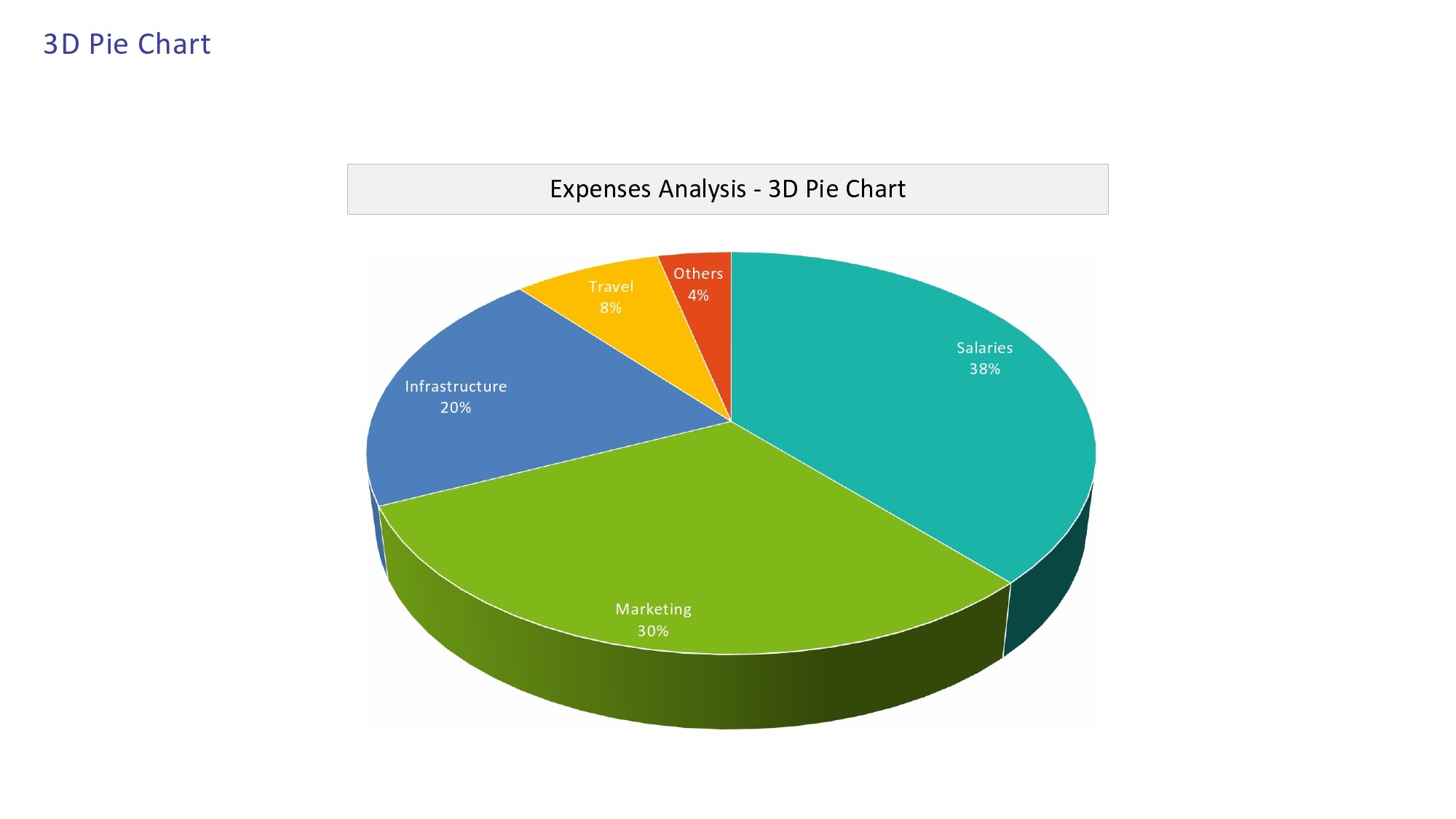
- Avoid 3D effects. While 3D pie charts may look visually appealing, they can distort the data and make it harder to accurately compare slice sizes.
- Consider alternative chart types. Depending on the data you are working with, a different type of chart, such as a bar graph or line graph, may be more appropriate than a pie chart.
Conclusion
Pie charts are a versatile and effective way to visually represent data. By following the tips outlined in this article and keeping best practices in mind, you can create informative and easy-to-understand pie charts that effectively communicate your data insights.
Pie Chart Template – Download

- Free Printable T-Chart Template - September 12, 2026
- Free Printable Wanted Poster Template - September 12, 2026
- Surprise Party Invitation Template - September 12, 2026
